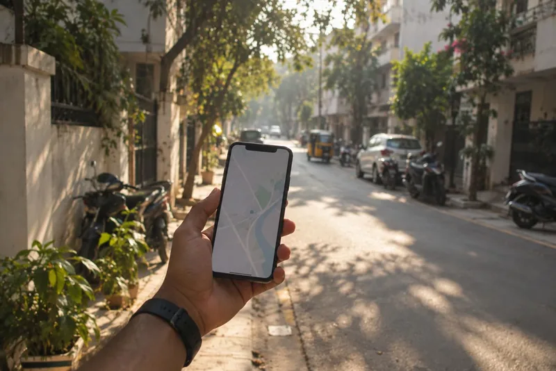
Why the map is the homepage
Designing StayOnMap started with one decision: a rental app where the map is the product, not a widget on a listing page.
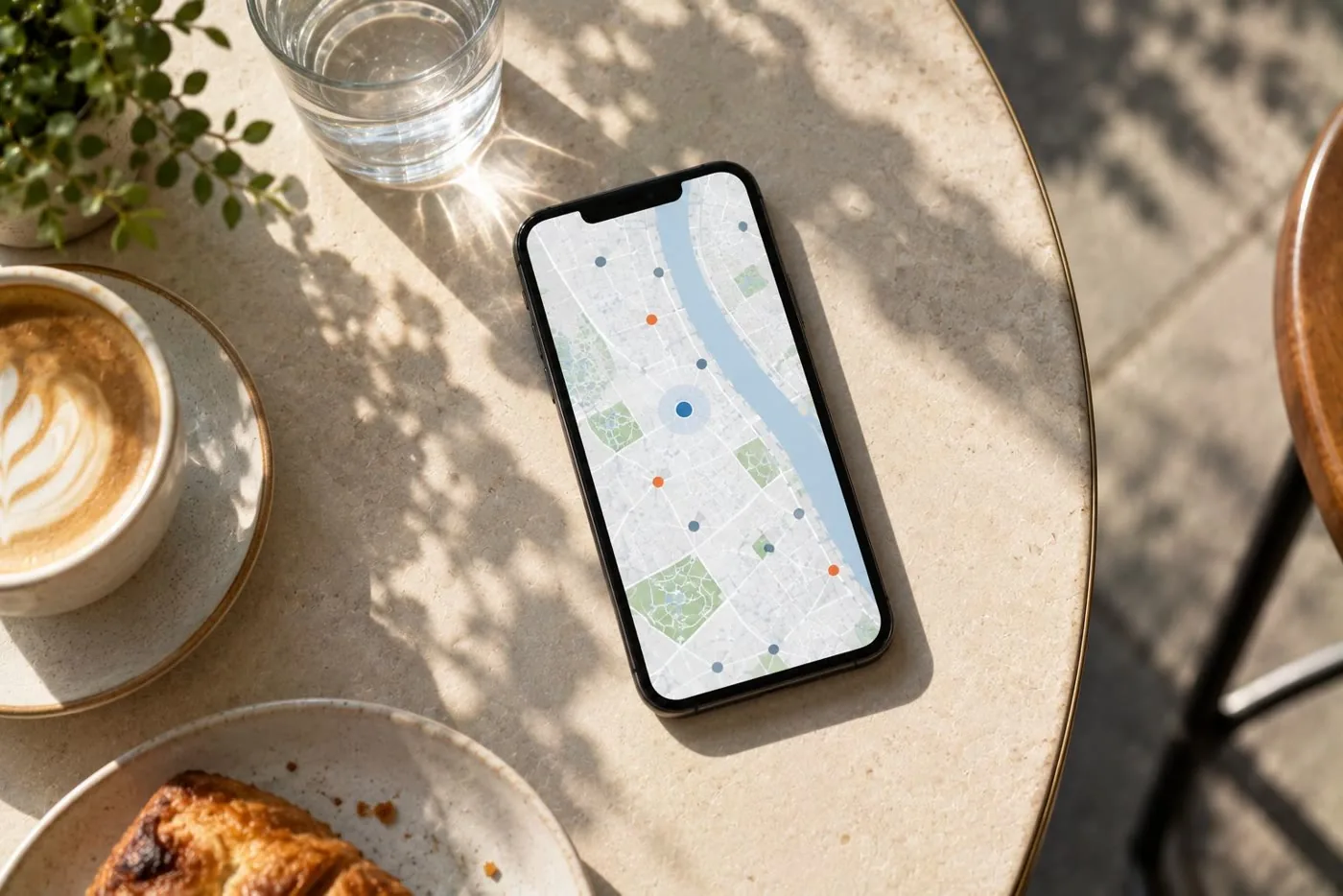
When people in India look for a flat, the first question is rarely "how many bedrooms?". It's "where?". Near the office, near the metro, near my parents, not across that railway line. Yet most rental apps open on a list: a feed of cards sorted by something you didn't choose, with the location reduced to a line of grey text.
So when I started designing StayOnMap, the first decision was the one everything else depended on: the map is the homepage. Not a map tab, not a map button on a list. The map is the product, and everything else floats on top of it.
What that decision costs, and buys
Putting the map first sounds simple until you design around it. A list can show twenty listings with photos and prices. A map shows pins, and a pin has room for almost nothing. That constraint turned out to be useful, because it forced us to decide what actually matters at a glance.
- Price on the pin, because budget is the first filter everyone applies.
- The kind of property as a small glyph, because a plot and a flat at the same price are very different things.
- Everything else (photos, trust badge, deposit, what's nearby) one tap away, in a preview that opens over the map instead of navigating away from it.
We also styled most of the base map's business labels off. A standard map is crowded with restaurants and shops, and they compete with the only pins that matter here. Removing them made the map calmer and the listings easier to see.
Panning is a query
On a list, searching means typing. On a map, panning to a neighbourhood is already a search. StayOnMap treats it that way: the visible area is part of the query, and a count of homes in view updates as you move. When you want a list, the count is the way in, and the list carries the same area and filters, so the two never disagree.
This shaped mobile too. On a small screen a full-screen map is easy to get trapped in, so a map embedded inside a scrolling page uses cooperative gestures (two fingers to pan) while the full-screen map takes every gesture. It's a small detail, but getting it wrong makes the whole page feel broken.
Being honest about place
Once location is the product, every fact about a place has to be trustworthy. StayOnMap shows what's around each home, and every one of those facts is labelled as measured, derived or estimated. Distances read "420 m away", never "6 min walk", because a straight-line distance across a railway line can be a much longer walk, and an invented walking time looks precise while being wrong.
I think that's the real lesson of designing map-first. The map makes location visible, so it also makes every shortcut visible. The design has to earn the trust the map invites.